This is the final poster:

Final Poster
This is the final poster:
Final Poster
This question, like the technology one has also been done on the presentation website Prezi.com
My presentation of this question:
http://prezi.com/j32chdxr5ypg/how-effective-is-the-combination-of-your-main-product-and-an/
I have answered the technology question using the presentation software Prezi:
This is beacuse it it very easy to use and makes the answer as a whole a lot more appealing and making full use of the digital technologies available fo us.
Here is our finished trailer for Forest Of The Unknown:
All of the feedback received was conducted using a questionnaire and also face to face feedback where we presented the three pieces to people and then noted the feedback that we received on apiece of paper and this is where we will explain the answers and go into a lot more detail about them.
From the audience feedback that I received, I learned that areas such as the font for the masthead and taglines needs to be clear enough (stands out) so the audience can clearly see the effect that the title will connote across to the audience Furthermore I can experiment and be more adventurous with my editing and creation of products, especially for ancillary 1 & 2, because previously I was only confident to do the little things that would make the product achieve the minimal level of standard. However because I have now received some positive audience feedback I can be confident in adding extra taglines/images to make that piece of work to the best of my ability.
The layout for the poster (ancillary 1) is very important because it is all well and good having the correct functions/information but if the layout of the piece of work isn’t very good then this isn’t going to get very good marks when it comes to the final grade as a whole. As a result we changed the layout of the poster (ancillary 1) a number of time to ensure that it looked right for the audience that we where targeting but also for the genre that we where aiming this at as well. This is why we where trying to base our poster on the Friday The 13th poster because we feel that this was very effective and was something that we wanted the ancillary one to come out as for the final product.

Real life Poster
Final Poster
For both the website and the poster, the feedback taught me especially how important it was to either follow, challenge or subvert the typical connotations that are associated with this type of genre (horror). This is because even the simplest of things can make the piece of work stand out but only if the connotations are clear and well presented. For example a piece of feedback that we received was that the “tagline and production logo not easily visible” and this helped us because it enabled us to see what people saw of the poster and the thoughts that they have about it.
In terms of the trailer, the feedback received was something that I learned a lot from as well. This is because before this unit I hadn’t really edited/constructed a trailer as a main source of coursework and this was my first time in doing this. The feedback that I got from my audience was that I need “to have something that picks the pace up” and we want to have tension building areas with some areas where it is fast paced and filled with quick, jumpy music/scares to back it up or go along side the actual trailer. This was achieved by adding a sound lip that was of a thunder strike and making the clip more stabilized to make it jumpy. We also received feedback on our trailer from Gabi and it was that the “The tense and nervous section should appear on separate slides to add to the tension to the film” and so as a result we took this feedback on board because we want t make sure that the trailer is right for audience within our demographic ag range
Furthermore we received feedback for the website and it would look better if we had a section that “was completely dedicated to the cast and crew” and this was something we had seen when looking at previous examples of horror websites/film websites such as World War Z. the cast and crew section is going to contain a little paragraph about the two actors involved and the other two members of the crew (me and Sam).
From the audience feedback I also leant that I need to check the colours being used in the form of printing before handing it in as the final piece. This is because we thought that we had the poster completed the colour of the title didn’t turn out as well as we originally hoped for. It was supposed to represent the colour of blood (#660000) and on the screen it looked very effective but in printed form it didn’t. And so from the feedback we learn that even the basic of colours can still connote the feelings that we want to across to the targeted audience of horror. We had received some audience feedback from Josh and Callum who said that it would be even better if the “text at the bottom stands out more” and so to achieve his we had centralized the credits at the bottom of the page and moved it up a bit in order for it to be more recognizable and for it to stand out a lot more.
Further feedback received was from Alex Ford and he said that for the poster: “I like the fact that the actor is wearing the same clothes in all of the shots”. And this was something that we decided to do because continuity was a major factor that we had to make sure we got correct because having ever changing outfits and scenes can draw the attention of the audience away from the focus of the trailer as whole.
We also got feedback from Alex on the website as well. This is what he had to say: “I didn’t even realise that the whole website was on one page, until I kept scrolling”
This is the type of feedback that we expected because having the website all on one page will enhance the users load time because of the information being all on one page. Furthermore we have learned that the website may take a lot longer to create but the final product was definitely worth it because the load time was reduced and all of the information was available at just a click of a button. Not only this but the website is their to support the other piece of ancillary work and we feel that we have achieved this well.
I also go some feedback from Matt and this was on the website. He said that: “I prefer this design for a website of this type, I dont think that it would work for any other type of website. I like the website as a whole, but I’m not a fan of the font because it isn’t really horror-ish”
The font is something that we took a gamble on because we thought that the font might be a bit childish and not as horrific as seen on other website buts this was the best one in terms of actually reading the content and understanding it as a whole. As a whole the feedback is very good because it allows us to change the design of it if we have to do it again or if we had more time to change it. But also we have learnt that just one font can seem repetetive and another font would make it look more appealing to the audience and the audience of our demographics as a whole
To summarise I think that the products that we have made are very good and to the best of our ability. Furthermore we received some very helpful feedback that will help us in the future with any projects that we may do because we have extra knowledge about what makes a good main product and also what makes good ancillary pieces of work. Some of the feedback was expected because 3we had to cut things out due to time constraints but overall we feel that some areas followed the conventions and some areas we subverted but we never challenged any conventions. This was because we knew that challenging would be really risky because through our research we knew what worked and what didn’t in terms of features and other conventions.
Here is the finished which we have uploaded onto a hosting site called ucoz:
Website: http://fotu.ucoz.com/fotu/home.html
The three media products that we have produced for this unit both follow and subvert the conventions of real media products. I think that because we have included most of the conventions that we can see in real media products that are around at the moment. We have also tried to include most of the conventions that we could possibly do to make the trailer, website and poster as realistic as possible.
Furthermore because the trailer has been made for this project we have included our production logo in the opening scene which is common is most films regardless of the genre.

Start Of Trailer
We have also included the green film rating part at the beginning of the film. This actually isn’t a convention because it is needed in order for it to be viewed by the public but we thought that we would add this into the film because it makes the trailer more realistic and believable for the audience of this film and this is the same for current trailers who have the rating at the beginning of the trailer to let the audience viewing it that it has been accepted as an appropriate film for the genre intended for.
Usually with good and effective horror trailer there is always some sort of phrase or sentence that gets the audience thinking about the contents of the film. I think that we have followed this convention because we have included the phrase “Tense? Nervous? You’ll Remember This Trip…” at the end of our trailer as a sort of cliff hanger. Furthermore we have a small clip in the film where the main character says “follow the sound of my voice!” which instantly entices the audience into thinking “What’s happened?” or “Whose missing?” Therefore this gets the viewers glued into the storyline, just like real trailers do and we have followed this convention.


However there are some aspects which suggest that we have subverted the typical conventions used by horror trailers. A trailer such as The Evil Dead for example uses very quick and sharp transitions to make the viewers jump out of their seats and create fear/danger when watching those scenes. But with our trailer we have used slow and long transitions along with a build up of tension to try and catch the audience off guard and throw something unsuspecting at them such as quick scare. For example there is a section of the trailer where it is all quite and calm with them walking through the forest and then it suddenly changes pace with the camera moving quickly and the sound building up with different music over the top.

Sound Effect Used
Another significant convention that has been subverted is the fact that we have used a bit more text than normal. This is because when looking at a trailer such as Paranormal Activity for example there is text spread out other the length of the video/trailer (shown on various scenes) however this is totally different for our trailer. There is one part that goes on for about 10 – 20 seconds where it is just purely text based and they are “Don’t Underestimate The Forest / From The Producers / Of “A Day In The Life” and this is something that we decide to do because through our understanding of the research, we found that the text is spaced out and gives the audience clips of the trailer but we decided to subvert this convention.
Furthermore this use of text hasn’t been used to separate the trailer into two ways at all. In fact it has been used as a sound bridge because the suspenseful music is being played in the background throughout the whole film to carry the suspense/tension right the way through to the end of the trailer.
Overall, the trailer that we have created follows typical horror trailer to a degree of certainty but there are areas which subvert as well. I actually believe that subverting conventions of a horror trailer is good because it gives the audience something else too remember the product by If the trailer followed and was the same as other trailers then people aren’t going to watch it because they would have seen it all before whereas the subversion or conventions is something that will hopefully stick in their minds because of what the trailer consisted of.
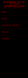
With regards to the website there is only one real outcome and this will be that the website has followed conventions and there a lot of things that need to be done in order to function correctly. In this case all websites need to include a menu in order for the user to navigate through the website and to get to the other areas/content for the website, several titles for the user to identify the specific page that they are on and what they are reading, along with other various pieces of information.
However for our website we have displayed the titles in different ways and gone for a fixed, drop down menu. The menu is also fixed in place which means that it doesn’t move when the page is scrolled and the pages are being navigated. A typical convention that is so common for horror websites is the use of darks colours that we have tried to use on all of our pieces of work. The colour schemes are there to keep the feel of the film, the evil/danger involved and the terror that is so often in horror films. As a result this is another convention that has been followed for this website for Forest Of The Unknown. The colours used are there to represent the evil nature of the film and the danger that will be involved for the characters included.
However another convention typically seen is the use of multiple tabs/pages for the user to navigate through. But for our website there is one main “home” page that has been created but it has been separated into different sections which are linked in the fixed menu on the left side of the page. Furthermore this is something that we have challenged because we wanted the website to be different in its own way in order to stand out from normal websites and this makes it easier to navigate as well because there are no loading times to find and get the next page ready, instead it just moves up or down depending on the page selected.
Overall, as with the trailer, a large amount of the conventions have been followed to make sure that it works well for the targeted audience. Furthermore there are a number of conventions that have been subverted because it will make it stand out more in the eyes of the viewers. Not only this but having the website layed out in a way that is different than other common horror websites will give us a better advantage because it will stick in the minds of the viewers for longer because of what we did differently. It will also enhance the users experience when browsing on the internet because of the overall look and feel of it.
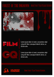
For the poster we wanted to make sure that we followed the conventions that are associated with horror film posters such as Friday The 13th. Furthermore we tried to achieve this by having the location of the poster in an isolated location such as a forest. For most of the comparisons, I wanted to go with Friday the 13th because this poster was very effective for the type of the horror film that where going for. Not only this but the dark colour scheme has been used because this is very common with horror especially red because this is showing the danger, evil and even the use of blood is going to be apparent within the trailer.
Furthermore another convention that we have followed is the use of the credits at the bottom of the posters. What this does is that it shows the actors that are involved but also the production company and the filming company involved with the trailer. Now even though this isn’t a convention specifically for horror, it is for all posters as whole and so we included this because this would have made the poster as realistic as possible to entice the audience into watching the trailer and viewing the poster as well. Along with this we have made the masthead slightly larger than normal. This because we really wanted the title to stand out and be there in front of the audience for them to see clearly. Another convention that we have followed is the colour scheme for the title.
Friday The 13th also has the same colour as our poster but originally this wasn’t going to be the colour. This was because a colour that was supposed to resemble blood was originally intended but when printed off it was too dark and completely out of focused. And so as a result we went for the basic red and this was a risk because I thought that this was going to be childish and not serious enough but actually it turned out really well.
Overall we have tried to follow as many of the conventions as possible because the poster is going to the fundamental piece of ancillary work that is going to draw the attention of the audience into watching this trailer/film. Furthermore we were trying to make the poster as realistic as possible and so we were always looking at examples such as Friday The 13th and Drag Me To Hell to base out poster upon to make sure that we got the conventions correct or the audience to look at .

Real-life poster
Final Poster
For the third stage of the website creation we have moved onto and we have made some significant changes to the previous post that was based around the website. After deciding on the structure and layout for the poster we then had to decide on the look of the menu bar which is so common on horror websites but specifically websites. We also want to make sure that we are always following the conventions associated with horror websites.
And due to time constraints, the website has been optimized for Google Chrome andSafari. This means that it will look at it’s best in this browser, and will not look as good in others.
the first decision that we had to make was what font we where going to use and which one would look best on all of our products. We searched into it and (the five fonts chosen are on a previous post about the specific fonts) we came up with the final one. The final font that we decided that we would us is called BloodFeast.this was the choice of font because it looked right for the genre of film that we have done for this trailer.
The first stage for construction was the to build the background for the website because this is where all of the links and the location of content is going to be when the website has been completed. Furthermore it will have to be adjusted in order for it to be zoomed in and out correctly within making it look messy and unprofessional.
The top of the page is going to include the trailer for this because when looking at examples on the internet we have noticed that the first thing that they display is the trailer to draw the attention of the audience into the film through the trailer. furthermore on the left hand side of the website this is where the audience will see the menu which is going to include links such as Plot, Characters, Behind The Scenes, Reviews, Trailer etc. This body for the menu is going to be a drop dow function to hold all of the information for the pages and to also save space.

Background For Website
This is going to be the main look of the website where it will be separated into sections with the different ancillary such as the Poster and trailer.
We also had to ensure that the ‘video’ was located in the very middle of the section (horizontally, not vertically) as to allow it to work well on different sized monitors and screens but also so that it could be zoomed in and out correctly without losing focus for the trailer.
Once the basic layout was completed we could then start to physically add in the content and so the first thing that we added in was the section for the trailer. We went for the colour scheme of red and black because this is a good connotation of blood, evil and danger. Evil was the effect that we are going for because ours is based on an evil spirit that has a psychological impact on the characters within the trailer but hopefully in the audience as well.

Character Section

For the next stage of construction we wanted to make sure that the character section included character profiles which had an image and a description about their characters within the trailer. A border will also be added to the images so that it ties in with the rest of the colour scheme. All of the fonts and colour schemes are going to be the same because it means that it looks even more professional but also it looks messy and not planned correctly if there are 3+ fonts being used a one point. place holder text has been put in place so we can see what the text will look like and what the final page for this section will also look like in the eyes of the audience. Furthermore the connotations of the colour scheme and th font is going to be key because of the effect that we want the trailer to have on people.

Place-holder text
Because this is a one page website, we have to display the images on the actual page, but doing that will make it look really untidy and messy because they wouldn’t be perfectly in line with one another or they may be different sizes depending on the image selected. This is why we are going to use something called a Lightbox. A Lightbox allows the use to click on a smaller version of the image, then be able to see the full size version appear on the screen. The first step in this is to place the images on the page and then we will make the image appear over the top of the rest of the webpage. The buttons will also allow them to view the next image without having to hit “CLOSE” and then open the next image that they wish to view.

“Now” and “Next” buttons have been added so the next image is available
The behind scenes video is going to be where we have the unused photos and video just to see what else we did whilst we were recording the trailer. the video has been made an edited on iMovie and has then been uploaded onto YouTube. The embedding of this video was very easy because all we had to was select the “embed” tab on YouTube and then copy & paste the coding into our coding for this section of the website.
The review has been done exactly the same as the other pages but instead we have just added some images and reviews that we made for the website to make it look more professional and to make sure that we continuing to follow the typical conventions for websites of the horror genre.
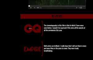
Review Section
The cast and crew were the next section that we constructed and this came about from the first load of feedback that we received for the website.
All that we had to do was that we had to add another section for this part of the website. We used the images from the profiles section because it had the red border and kept in with the appropriate colour scheme of this trailer (red and black).
I will put the description of the person directly below the role of said person, which can be seen in the screenshot below.

Cast and crew which will have a description about the actor.
And finally all we have to construct is the menu bar on the left hand side.
As I mentioned right at the very start of this post, the menu will be housed in the left hand side of the website. Also the title of the website (Forest of the Unknown) and the Global Productions logo will appear in this section.
The same colour scheme has been used throughout the whole course all the ancillary work because we wanted to keep connotation of horror and other evil related connotations.
The title of FOREST OF THE UNKNOWN was made using Adobe Photoshop and was then imported to create the top of the menu body.
When making the menu for the website, we wanted to make sure that we kept the same colour scheme and use the same font that has been used on the rest of the website.
When thinking about the type of menu that should be used on the website, I thought that an expandable and collapsible one would best suit the needs and requirements of our website. As I have previously mentioned,, it would be used to cover all sections of the website, in the amount of space that is available on the website, while still having the font large enough to read.
New Menu Bar With The Title & Contents
The included items such as the Cast & Crew will be added into the collapsible bar on the left hand side, because we where originally going to have just the cast and crew at the bottom underneath everything but this would have made it look untidy and isnt a main topic for the website anyway unlike the Trailer, Poster, Behind the Scenes etc.
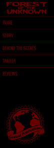
Logo Situated On The Bottom

Added sub-item
The website has now been completed. The different sections and content of the website have been added in the main menu now allows the user to navigate their way around the website.
I feel that overall, the website achieves its goals and fulfils its purpose of informing the visitors about the plot of the film, and characters, and the various people who were involved in the production.
The poster has now finally been finished and this is the version of the poster.
There have been some significant changes in the way that we have added some extra logos and conventions to the poster. Two logos have been added to the bottom of the page and using he black space that was available to use, therefore taking the effect away from the isolated, eerie and mysterious look of the poster.
As I have previously mentioned, the colour of the masthead has been changed to enable it stand out when looking at the printed copy of the poster. furthermore we have situated most of the content at the bottom of to page to make sure that the focus of the poster wasn’t all over the place and that the victim of the trailer was easily visible as well. Furthermore I also believe that we have followed the conventions that are normally associated with horror posters such as Friday The 13th and SAW. From this we decided to put everything at the bottom of the page.
And now we have managed to get the poster the way that we want it to be. This is now going to allow us to get feedback on it make some last minute changes, if they are serious or not and then help us to answer one of the evaluation questions which is about what we have learned from the audience feedback given to us.
Final Poster
After the first stage was completed of thinking of ideas and choosing the basic layout/content that we where going to use, we then had to decide on two “prototypes” that we would quickly created to get the basic view of how we wanted the the website to look like when we completely finish it. And so as result we did two designs and then once we had done them we would decide together which one would be better appealing not only to us but to the audience that we where aiming this website at.
Design 1:
We wanted this design to be a basic first layout but we had to make sure that it followed the conventions that we looked at when we constructed the research for this task. And so on this layout we have done a basic but very effective layout of having the information there are ready for the users to see when they go onto the website for the first time. The title and menu appearing at the top, with the main feature below, more content below that and then the footer. Not only this but the website will have a navigation menu that involves taking the user to different pages of the website. We will have top make sure that the features and typical conventions are clearly visible for the audience.

These are just the first conventional mockups of the website and we have just been playing around and checking to make sure that the basic layout of the website is good enough and going to be well placed for the final design. furthermore seeing as this is just a mock up we haven’t inserted any other parts of the project such as the trailer and poster because that would seem like a lot of work for just a draft mock up but we are constantly thinking about this as well. As a result this is going to mean that the user will spend a bit of time scrolling down the webpage to find the content and this something that we will have to take into consideration before deciding on the final website.
Design 2:
For the second design we have decided to go for something that subverts the conventions normally seen of for website based around films. Subverting can be seen as a good thing because changing some of the rules ever so slightly can be the difference between a good website and a brilliant website. And so as result we have made a linear displayed webpage and this design to decide between.
Depending on what design we want to go for there is something that will stay the same and this is the content of the layout for the websites. We are going to have:
The order of this may change but these are the tags that we are going to have and they will have the individual information that is needed for each section. However if need be we may have to get rid of some parts because we may not create that bit of content because we may not have time and we may feel that it isn’t needed but this will change and progress as we go through the project.


Verdict of Designs:
After some talking and speaking to our peers we have decided to go for the second design because this means that we are going to be able to add more content and make the website look more appealing to the target audience and to other viewers of this website. There will be section that will be completely devoted to the trailer and this will have the trailer linked to our YouTube in which the trailer will be uploaded to either my channel or Sam’s channel. Here is a very simple colour scheme on this website, there are three colours used here. Black, Red and White. These colours allow the user to easily see the content on the page without having to strain their eyes too much. This differs from the top design because there is only one shade of red (#660000 incase you’re interested) whereas on the first design there were multiple reds, overpowering the rest of the page.
